A small social club for people who ride together.
A mobile app that helps motorcyclists find group rides, plan routes, and stop messaging their friends one-by-one to ask if Saturday's still on.
Fourteen replies. Still no plan.
Long‑distance rides usually start as a thread in someone's chat. By the time the route is decided, the meet point is buried under fourteen replies and at least one person shows up an hour late at the wrong petrol pump.
I designed RideConnect as a concept project to see how much of that coordination could move into a calm, focused product — without turning it into Yet Another Social App.
Three design principles I held onto.
Calm coordination
Move the route, headcount, and petrol-pump location out of the chat into a single, uncluttered card every rider sees instantly.
Instant clarity
Show pace, terrain, distance, and skill expectations up front so nobody joins a ride they aren't prepared for.
Zero gamification
No streaks, no XP, no badges. Motorcycling is already rewarding — the app is a tool, not a game.
I started by listening, not sketching.
Before drawing a single screen I wanted to understand how riders actually plan a Saturday ride today — what tools they reach for, where it falls apart, and why so many of them have quietly given up and gone back to a group chat. I ran a small, mixed-method study.
1:1 Interviews
Forty-minute remote calls with active weekend riders, aged 24–45, who ride in groups at least monthly.
Competitive Audit
Teardown of Rever, Calimoto, REVER and the humble WhatsApp group to map what each gets right and wrong.
Forum Lurking
Read through r/motorcycles and three regional riding-club threads to surface recurring coordination gripes.
- RQ1 How do riders currently find and commit to a group ride?
- RQ2 Where in the process does coordination break down most often?
- RQ3 What would make a rider trust a new app over their existing chat?
The same three frustrations, every time.
Across all five conversations the story rhymed: planning lives in a chat that wasn't built for it, nobody feels like the plan is ever final, and most existing apps try to turn riding into a points game. A few quotes that stuck with me:
By the time we agree on a route, the meet point is buried under forty messages. Someone always shows up at the wrong pump.
I don't want another app that gamifies my hobby. I just want to know who's coming and where we're meeting.
Half the time I skip a ride because I never saw the plan get finalised. It just kind of dissolves in the chat.
What the research told me.
I clustered the interview notes and turned the strongest, most repeated signals into three insights that went on to drive every product decision.
Coordination, not discovery, is the real pain.
Every rider could find people to ride with — the breakdown was always agreeing on the details and trusting they wouldn't change.
“Is it actually happening?” causes drop‑off.
Without a clear committed roster and a locked meet point, riders silently opted out rather than chase the thread.
Riders are allergic to gamification.
Streaks, XP and badges read as noise. The product had to feel calm and utilitarian — a tool, not a toy.
From sticky notes to themes.
I dumped every observation onto a Miro board and grouped them until four clear clusters emerged. These themes became the backbone of the information architecture.
Who I designed for.
The interviews converged on one recurring character — the casual weekend rider who loves the ride but resents the logistics. I gave him a name so every decision had a face to answer to.
Goals
- Find good weekend rides near him without effort.
- Know exactly who's coming and where they meet.
- See the route and difficulty before committing.
Frustrations
- Plans dissolve in a noisy WhatsApp thread.
- Never sure if a ride is actually still on.
- Existing apps feel bloated and gamified.
The happy path, mapped.
With a persona and clear insights, I mapped the core journey as a flowchart — from opening the app to standing at the right petrol pump on Saturday morning — including the decisions and detours, before committing anything to layout.
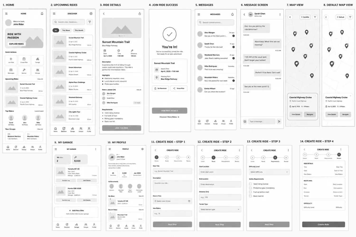
09 · Mid-fidelity wireframes.
14 key screens built to test layout density, navigation hierarchy, and the 4-step ride creation flow before visual polish.
From planning to participation.
Motorcycle adventures are often fragmented across multiple tools — riders use one platform to organize routes, another to coordinate with groups, and separate channels to communicate with participants.
RideConnect brings the entire journey into a single experience. Riders can create and publish rides, explore adventures shared by the community, and join events with complete visibility into route details, requirements, and fellow participants.
The experience was designed around a simple rider journey: Create → Discover → Join, ensuring every interaction feels intuitive, connected, and community‑driven.
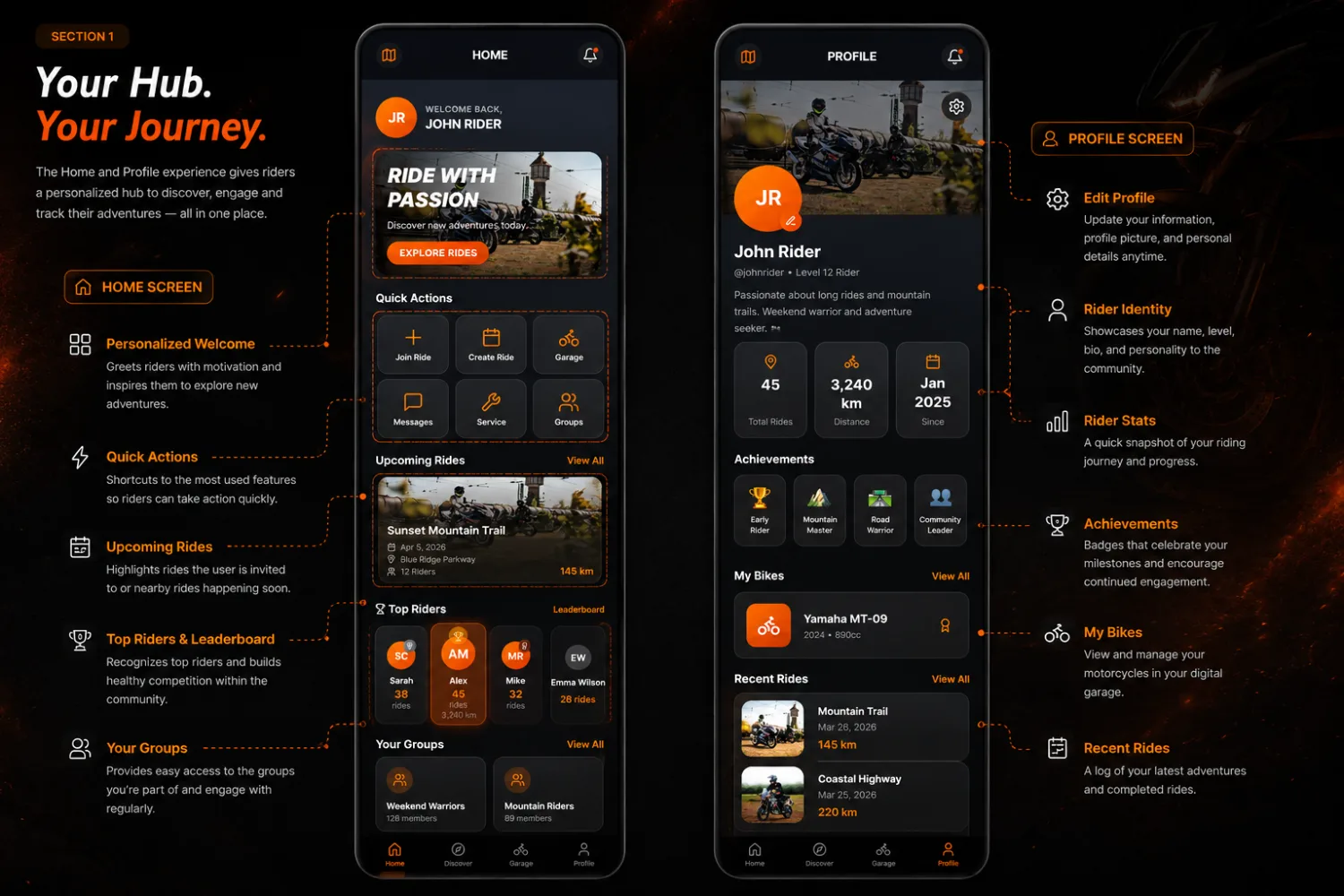
Your hub. Your journey.
The Home and Profile experience gives riders a personalized hub to discover, engage, and track their adventures — all in one place. Every element earns its spot: quick actions for the things riders do most, a leaderboard that builds healthy competition, and a profile that doubles as a rider's identity in the community.
Designing the rider journey.
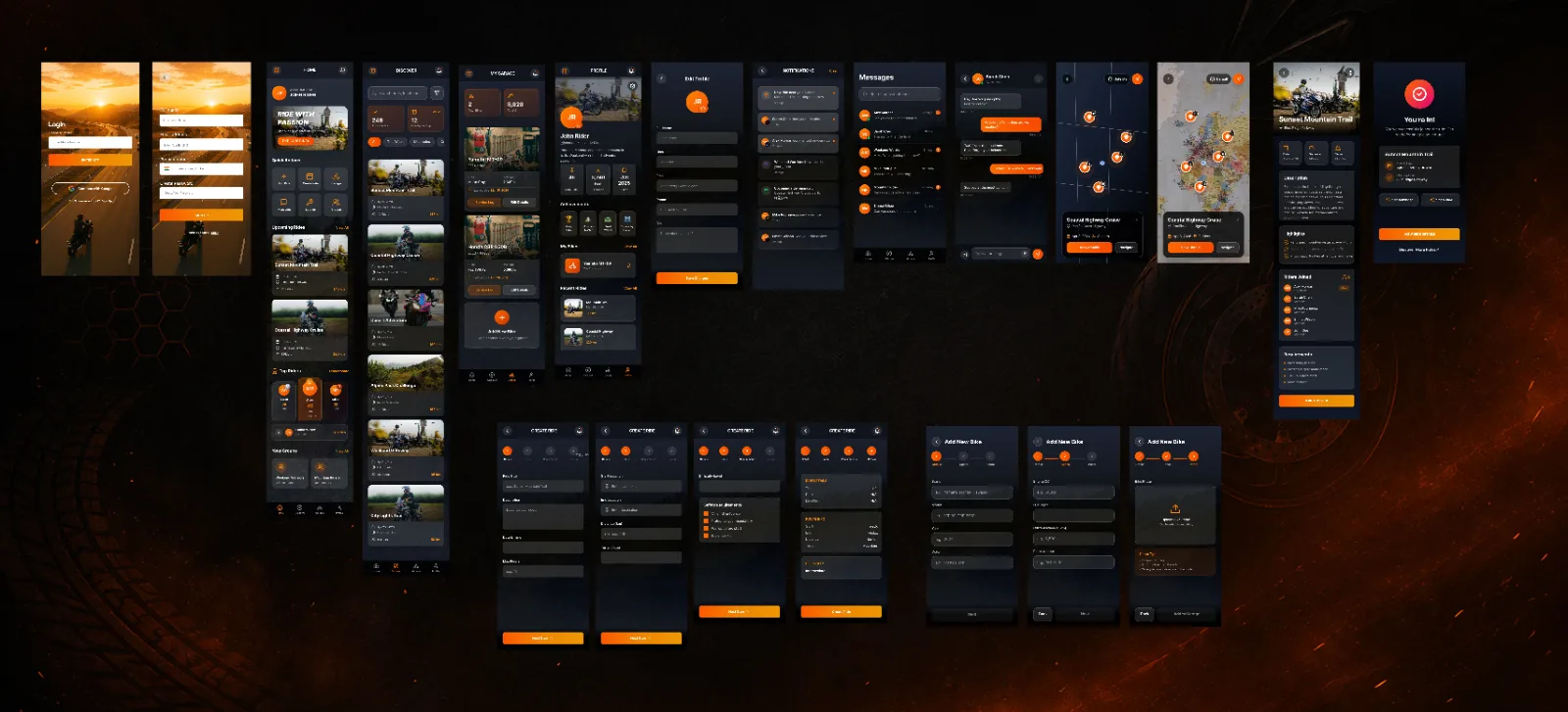
At the core of RideConnect is a simple flow: create an adventure, discover opportunities, and join rides with confidence. Rather than treating these as separate features, the experience was designed as one connected journey that helps riders move seamlessly from planning to participation. High-contrast dark UI for outdoor readability, single-tap actions for gloved hands, and a structure that puts route + meet point above everything else.
What I learned designing it.
RideConnect came down to one discipline: deciding what the product refused to be. Rather than absorbing every group chat, forum, and maps app riders already juggle, I anchored everything to a single sentence — create a ride, discover one, join one — and cut anything that didn't move a rider along that path. That restraint shaped the rest: giving the Garage its own tab because a bike is identity, not a setting; splitting Create Ride into a forgiving four‑step flow; and designing visible trust — rider profiles, joined rosters, clear requirements — so strangers feel confident riding together. The hardest call was leaving out streaks and XP, but a calm, utilitarian tool is exactly what this community asked for.
What building this taught me.
Design for calm over engagement
Every time I tried to add a feed or social feature, riders in testing recoiled. The win was removing options until only coordination remained.
Small sample, deep signal
Five in‑depth conversations yielded clearer insights than 100 survey responses because I could probe the emotional friction of a failed ride plan.
System before screens
Mapping the roster lifecycle and meet-point states first made screen layout trivial — the visual design simply rendered the underlying model.
Future opportunities to explore.
Live ride tracking & group navigation
See the whole pack on one map in real time, with turn‑by‑turn guidance and a "regroup" signal when someone falls behind.
→Route recording & replay
Record a completed ride and publish it as a shareable, repeatable route — turning every adventure into community inventory.
→AI‑powered recommendations
Suggest rides matched to a rider's bike, terrain preference, and history — so Discover gets smarter the more they ride.
→A real safety layer
SOS, crash detection, and live location sharing with trusted contacts — what makes riding with strangers genuinely safe.
→